Tags Over Time
The views shows how the applications of each tag changes over time, allowing you to better understand how customer conversations are adapting based on new product releases, external events, etc.
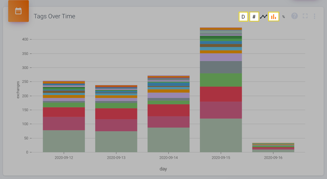
By default the view will show you a "Stacked View" by Day, without labels, but there's several different ways to display the information in this widget.
Stacked View
The stacked view is the only option where you can drill down into records. This, combined with the fact that it shows you how the total volume of tags changes over time, makes it best for a quick view that you regularly check in on.

The default view. Hover over a segment of a pillar to view its usage or click on it to open up the relevant record details.

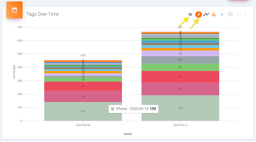
Change the time buckets by clicking on the letter. Choose whether labels are shown by clicking on the #.
Line View
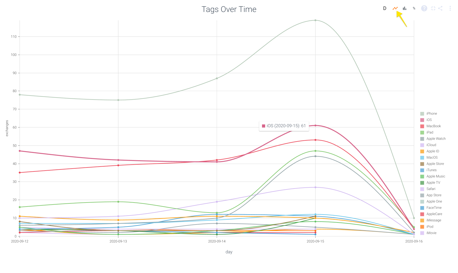
The line view is best for quickly comparing the volume of specific tags, since it clearly shows you the peaks and valleys of each tag. This type of understanding is hard to glean from the stacked view, where you have to read labels and/or try and manually deduce whether a specific segment of a pillar gets bigger or smaller between time periods.

If you're having trouble distinguishing between colors, hover over a specific line to see which tag it represents.
Percentage View
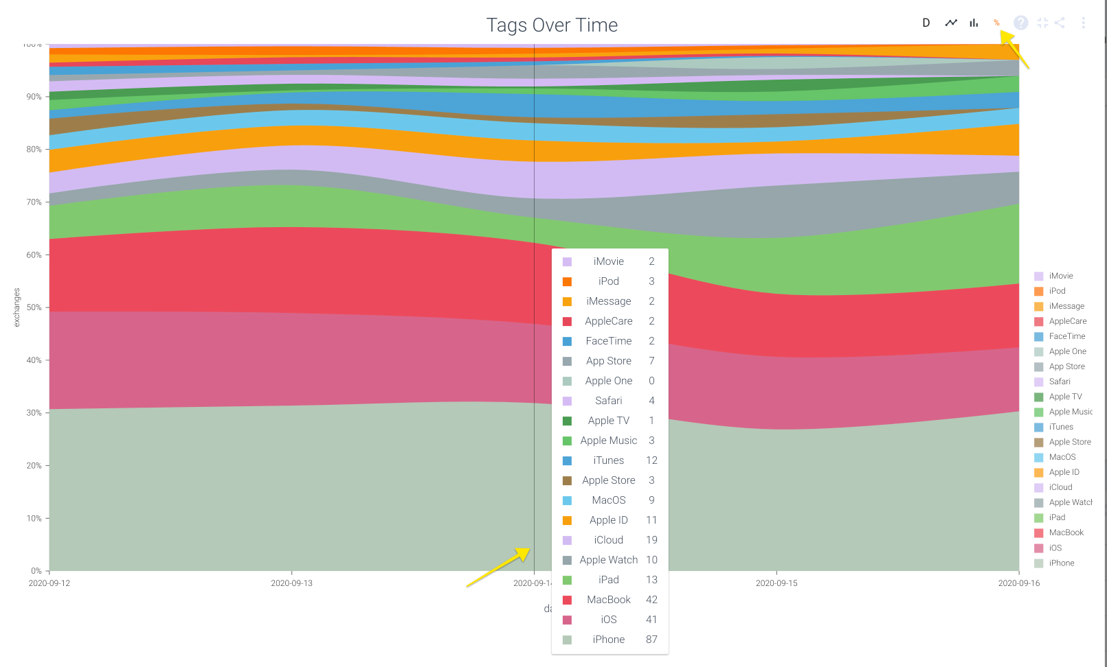
The percentage view is great for a holistic view of how much customers are talking about a topic while removing variation due to volume of conversations. It can tell you which topic pops up the most, regardless of whether you had 10 or 100 or 1,000 support tickets this month.

If you hover over the vertical space that corresponds with a specific time bucket, you'll see the breakdown of how many times each tag was applied to your metric of choice.
Updated over 1 year ago