Scores
The Scores dashboard provides increased visibility into factors that impact customer experience. Scores can tell us what makes an experience difficult, what makes customers unhappy, and what makes your team's experience challenging or inefficient. The dashboard comes with pre-configured scores that use multiple factors to estimate common areas of concern like Escalation Risk, Team Effort, and Product Friction. Each score can be completely customized and new scores can be created to track other areas of interest to your business.

All scores are calculated per record for the current search period and then accumulated.
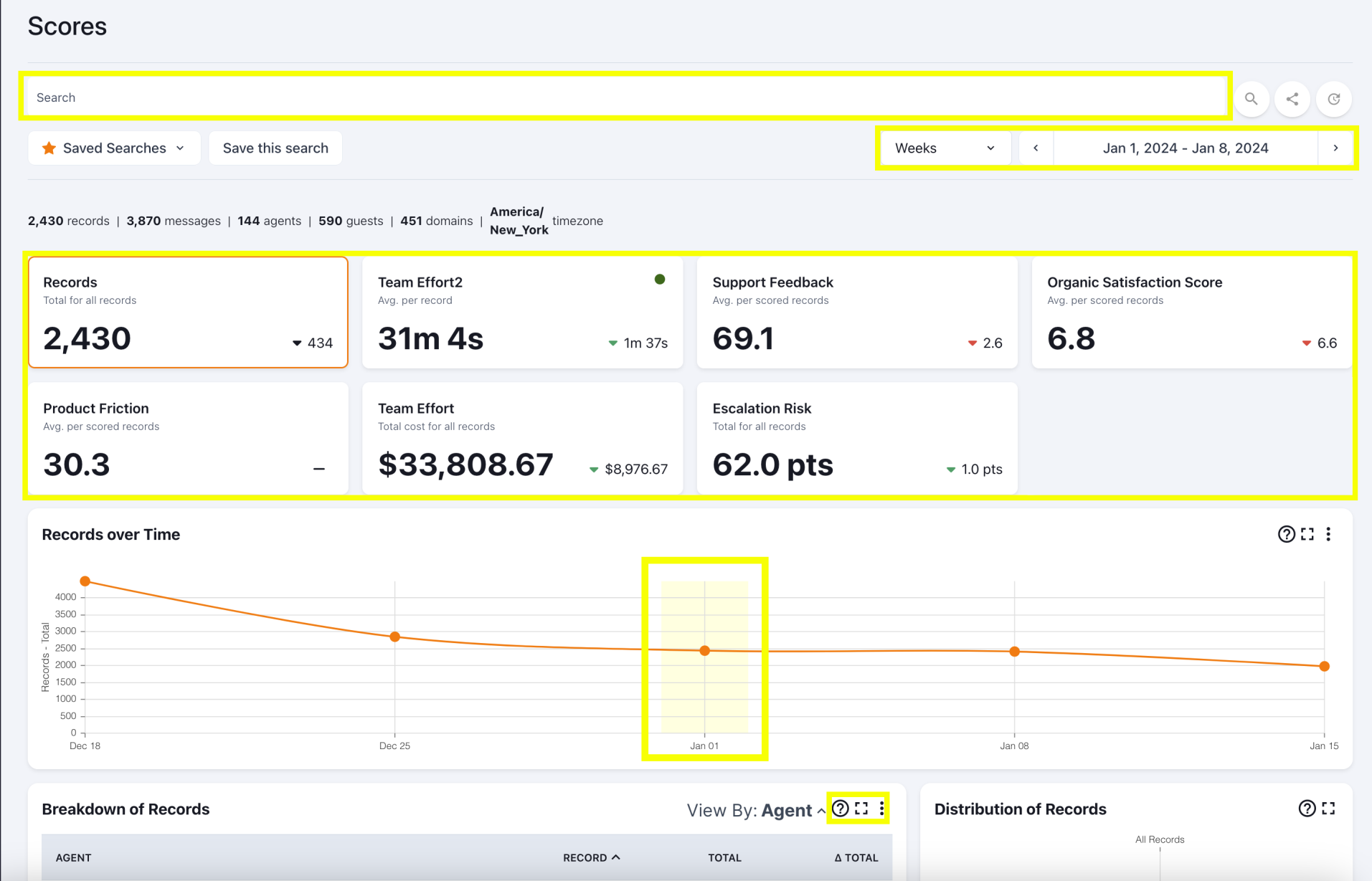
Key elements of the scores dash layout are highlighted above. From top to bottom they are:
- Search bar. Click inside the search bar to open a dynamic list of available search options. Press enter or click the magnifying glass next to the search bar to trigger a search. Every search reloads the rest of the scores dashboard so you only see results relevant to your search.
- Below the search bar on the right side of the screen is the time period selector. This selector controls the time period for all data in the other sections of the dashboard.
- Score cards show you all the different scores configured in your workspace. The rest of the Scores dashboard focuses on one score at a time and you can click on the scorecards to switch between scores. The active score card has an orange border.
- The Records over Time time series chart, called overtime, shows you the score for every time period in your search and provides additional context by showing the results from the two periods immediately before and after if they are available.
- The colored area in the overtime view highlights the start of your configured time period along. You can change the time period by clicking on the overtime view instead of the selector on the top right corner.
- Every view on a dashboard includes at least three options in its top-right corner: Tooltip explaining what the view is, Maximize the view, Export the view's data (including data not shown) to a CSV
Updated over 1 year ago
What’s Next