Breakdown and Distribution
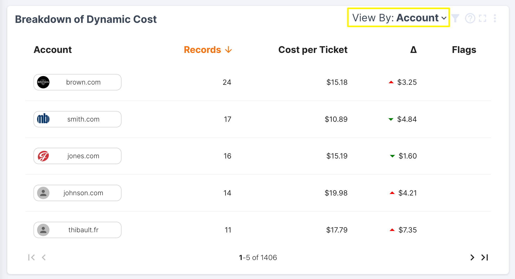
The breakdown table below shows record count, cost per ticket, trend (compared to the previous time period), and flags. Scorecard selection at the top of the dashboard will determine the metrics shown in the breakdown table. In this example, we have selected the Dynamic Cost score (also shown in the top left corner of the widget).
- To change your breakdown view, select an option from the dropdown in the top right corner of the table. Clicking the filter icon to the right of this dropdown also allows you to search for a specific account, agent, or record.
- The table sort order will default to record count (high --> low) but can be sorted by clicking on a column name. The column will then be highlighted in orange to indicate the new sort order.
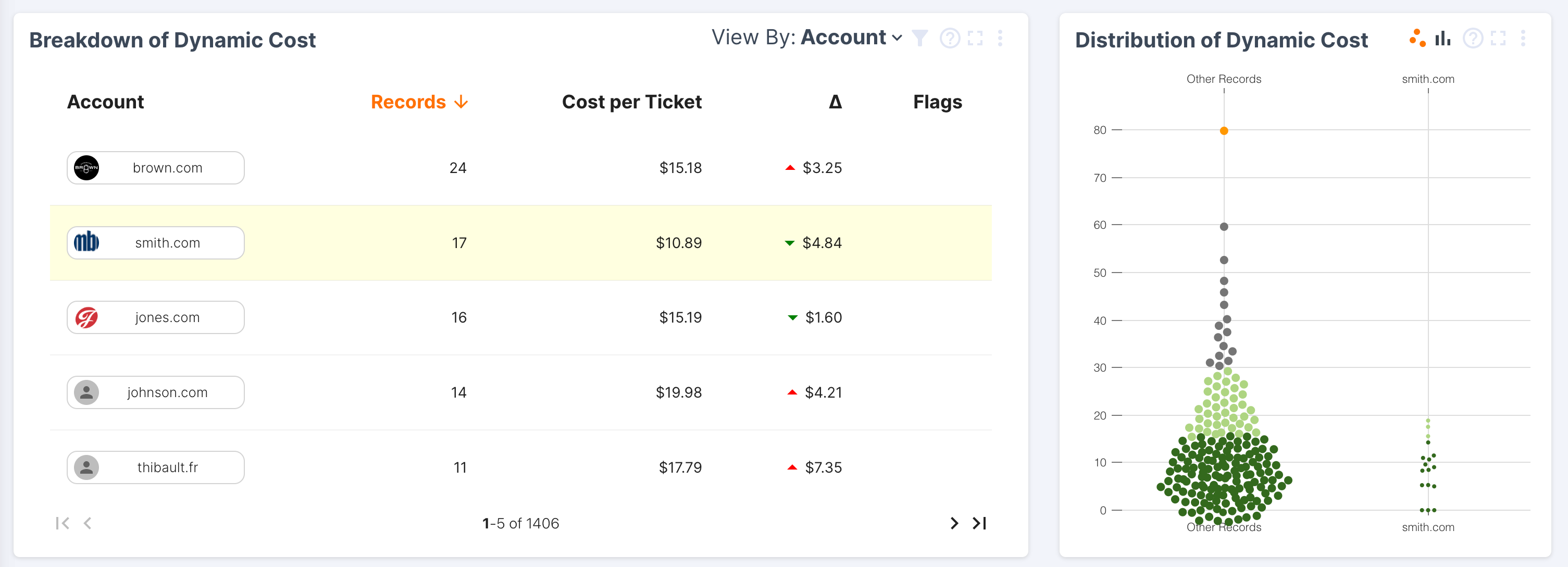
- Clicking on a row will highlight it yellow and filter the contents of the rest of the dashboard. This allows users to drill down and explore factors and verbatims for a specific entity.

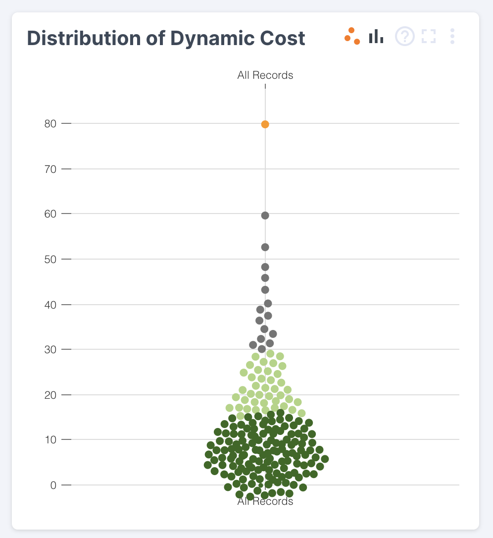
The Distribution graph shows the distribution of values in your data. In this example, the Dynamic Cost score ranges from 0 to 80. You can hover over any of these to see the number of records included and their value.

When you select a specific entity in the breakdown, the graph will update to show you this entity's distribution vs. all other entities. For example, the view below compares smith.com's Dynamic Cost vs. all other accounts. This view can help you understand whether a score for a specific account/case/agent is due to a single, non-typical case or larger trends in performance for that entity.

Want more breakdown views?
Learn how to create custom breakdowns here: https://help.frame.ai/docs/breakdown-configuration
Updated over 2 years ago